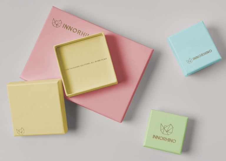
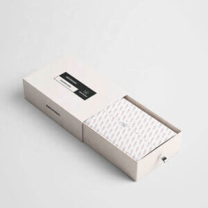
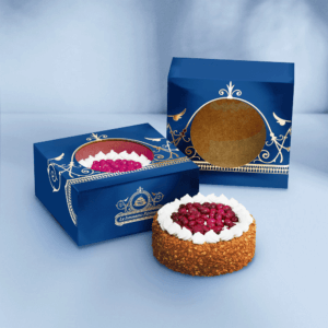
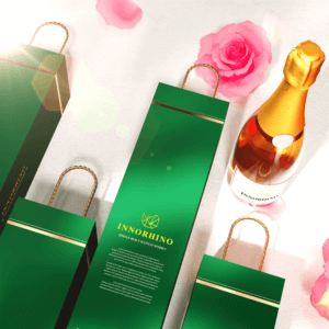
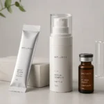
Have you ever noticed that a subtle, light-colored packaging design exudes a sense of elegance and sophistication while a vibrant, multicolored design instantly makes you feel energized or excited? That’s true not just with packaging designs, but also with interior designs, marketing & branding, and even with therapeutic treatments (for example the colors used in a psychiatrist’s clinic).
Color psychology is used by a number of fields for various different purposes. However, in the last few years, it has found a very special place in the field of branding, owing to its amazing superpowers of invoking a very specific emotional response in the minds of a targeted group of customers. In fact, you’d be surprised to know that according to a study, 85 percent of consumers cite color as the main reason for buying a particular product.
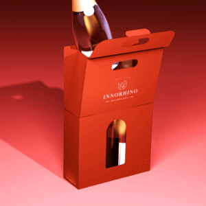
Picking the right mix of colors for your brand’s packaging design is very important because it’s that one component which is the easiest to recognize, even from a substantial distance. Before your customers pay attention to what kind of graphics, shape, or text is there on the packaging, they tend to notice its color scheme.
4 Tips to Choose the Right Colors for Your Brand’s Packaging Design
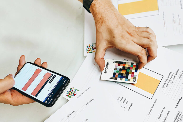
📍 What Does Your Product Represent?
Depending on the nature of your product, pick colors that best represent what it stands for or what kind of ingredients it is made up of. For example, if your product is a handmade soap made from jasmine flowers, picking a white-colored packaging makes a lot of sense.
📍 Who’s Your Customer?
Your customers should be able to connect with the colors you’ve picked. So, it’s very important to keep your target audience in mind. Understand their motivations, mindsets, needs, and cultural inclinations. Determine who are they exactly? What’s their age group, level of education, financial standing, etc.
📍 What Message Do You Want To Send Out?
Since different colors are associated with different kinds of moods, emotions, and energies, you need to pre-determine what kind of message you want to send out. Do you want your customers to feel excited and adventurous? Or you want them to feel comfortable and relaxed? Pick colors that correspond to the emotional state you want to invoke in your potential customers.
📍 In Sync With Your Brand Image
The colors should complement the core theme of your brand’s identity. It should clearly be in sync with your company’s brand image. For instance, if everything on your website including your logo is pastel-colored, you can’t suddenly pick an extremely dark-colored packaging design for your products.
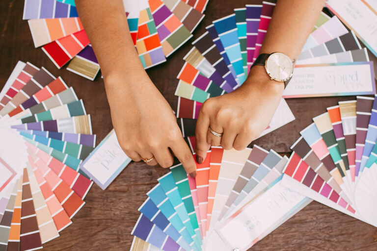
By following these simple rules you can decide which colors are best suitable for your brand. If you are still unsure, below we’ve decoded some of the most commonly used colors for your convenience:
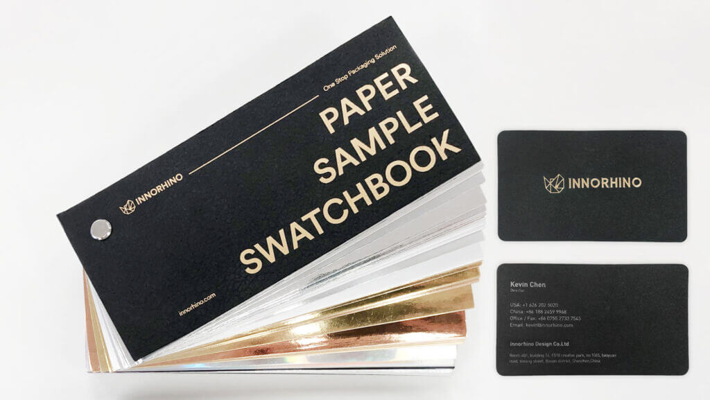
Image source: INNORHINO, Unsplash, Pexels
Check our Instagram for more packaging ideas, inspirations, and insights! ![]()
