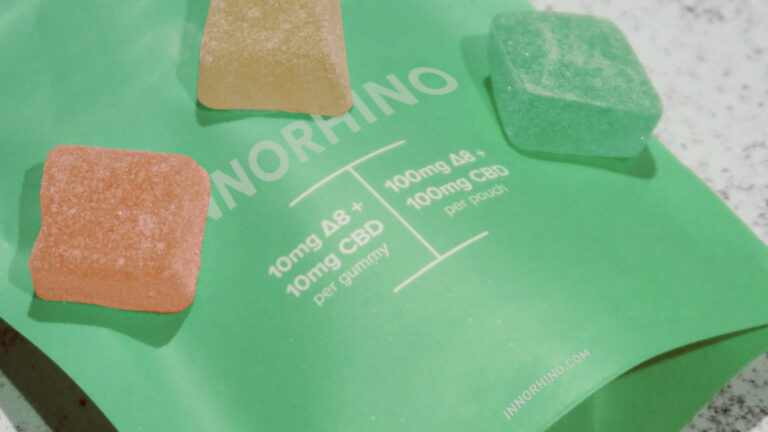
Spend first on what shoppers see where they actually choose: a front panel that reads clearly from a display case and in a small online-menu photo, with brand, product type, and strength easy to find. Then add one finish that fits your price tier. Structural novelty and stacked finishes pay off only when price and volume can absorb the cost.
This applies most to brands selling through dispensaries with display cases and online menus. Premium finishes help justify a higher price but add cost and lead time, and some are restricted in plain-packaging markets. Before committing, photograph samples at menu size, view them from shelf distance, and price at least two finish options at your real order quantity.
Most cannabis packaging design on a monitor, at full size, a few inches from the screen. Customers rarely see it that way. They see it behind glass across a counter, in a budtender’s hand, or as a thumbnail on an online menu next to dozens of competitors. Design decisions that look strong in a presentation file can disappear in those settings, while simple choices about hierarchy and contrast often carry more weight than an extra finish. This article covers where design spending tends to affect sales, and where it mostly adds cost.
It assumes your package already meets the rules for your market. For compliance requirements by state and country, see Cannabis Packaging: A Complete Guide to Compliance, Formats, and Sourcing.
Design for how customers actually see dispensary packaging
In many dispensaries, products sit in display cases or behind the counter, and a budtender hands them over after a short conversation. Many shoppers have already browsed an online menu before they arrive. That gives your package three moments to work: a quick glance from a distance, a close look in the hand, and a small image on a screen.
Each moment favors different things. At a distance, contrast, color blocking, and a large brand mark matter more than fine detail. In the hand, material, weight, and how the package opens start to shape perceived quality. On a menu, the package is often reduced to a small square, so fine type, subtle textures, and low-contrast finishes largely vanish. A design that only works in one of these moments leaves the other two to chance.
Get the front panel hierarchy right before adding finishes
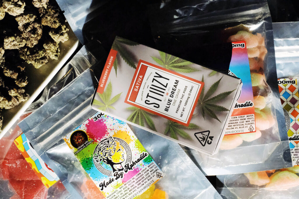
The cheapest improvement is usually hierarchy, not decoration. Decide what a shopper needs to identify in the first second, typically the brand, the product type or strain, and a strength or format cue, and make those the three largest elements on the front panel. Everything else, including required warnings, belongs in a clear secondary zone. Lay out the mandatory compliance content first so the brand design isn’t squeezed later.
Across a product line, consistency does more than any single package. When every SKU shares the same layout, brand position, and a color system that separates product types or strains, the line reads as one block on a shelf or menu, and customers can find their usual product again. The trade-off is flexibility: a rigid system can make limited editions harder to distinguish, so leave one element, such as a color field or pattern, free to change.
Design choices also face rules on youth appeal and, in some markets, on branding itself. Check those limits before the concept stage, not after artwork is final.
Choose finishes that fit your price tier
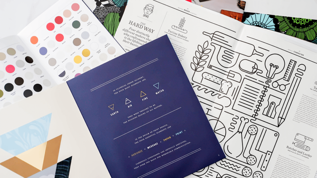
Finishes are where many packaging budgets go, and where the return is least predictable. A finish helps when it reinforces a price position the product can actually hold. Stacking several finishes on a mid-priced product mostly raises unit cost and adds production steps that can extend lead time.
| Finish | What it signals | Works best on | Watch for |
|---|---|---|---|
| Hot foil stamping | Premium, gift-worthy | Logos and small accents on paperboard or rigid boxes | Adds a production step and tooling; very fine detail can fill in; restricted in plain-packaging markets such as Canada |
| Spot UV | Contrast and depth without metallic shine | Coated or laminated paperboard, often over a matte base | Needs a compatible surface; the effect is subtle and often disappears in photos |
| Embossing / debossing | Craft, tactile quality | Rigid boxes and heavier paperboard | Tooling cost; depth limited by board thickness; invisible on menu images |
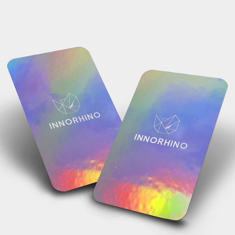
| Holographic lamination or film | High visibility, novelty | Pouches, sleeves, accent panels | Can read as low-end if overused; complicates recycling; check youth-appeal rules |
| Soft-touch lamination | Understated premium | Folding cartons and rigid box wraps | Shows scuffs and fingerprints; mostly a hand-feel benefit |
Material and finish have to be chosen together. Some effects need a coated or laminated surface, some films don’t take foil well, and deep embossing needs a thicker board. Ask your supplier to confirm finish compatibility on your actual substrate and to provide a physical sample before you approve it, because screens and PDFs can’t show how a finish catches light.

Differentiate without inflating unit cost
If your price tier can’t carry premium finishes, differentiation can come from elsewhere. Options that tend to add distinctiveness without heavy per-unit cost include a strong, consistent color system; a stock container with a custom label, sleeve, or outer carton; one recognizable structural detail repeated across the line, such as a distinctive closure color or opening direction; and illustration or pattern work, which costs design time rather than production cost.
Each has a limit. Stock containers are the same ones competitors can buy, so the label and outer packaging have to carry the brand. Custom structures reduce that problem but bring tooling costs, minimum order quantities, and, for child-resistant packaging, new test requirements. Before choosing, price at least two options at your real order quantity and SKU count, not a single hypothetical run.
Treat function as part of the sale
Repeat purchase depends on what happens after the first sale. Packaging that is hard for adults to open, doesn’t reseal, or lets flower dry out works against the brand no matter how it looked on the shelf. Child-resistant closures are a common pain point: they have to stop children, but a mechanism that frustrates adults every day is a reason to try another brand next time. When you compare CR options, have several adults open and reclose samples repeatedly, not just once.
Format matters too. Pre-rolls, vapes, and small edible packs are often carried around, so size, profile, and durability in a bag or pocket are part of the product experience. For flower, a reliable seal and odor control matter more than any finish; see How to Keep Your Cannabis Fresh.
Sustainability cues can support a brand, but only when the claims are specific and true for the materials you use. The trade-offs between recyclability and child resistance are covered in the complete guide.
A quick check before you approve a design
- Shelf test: Place a printed sample next to competing products and view it from counter distance. Can you identify the brand and product type in about a second?
- Menu test: Photograph the sample and view it at thumbnail size on a phone. Does the product still read, or does it blend into the background?
- Line test: Put all SKUs side by side. Do they look like one brand, and can each one be told apart?
- Cost test: Is the finish or structure justified by the price tier at your real order quantity?
- Function test: Can adults open, reclose, and carry it without frustration?
- Compliance check: Has the final artwork been reviewed against your market’s rules before files are released?
Reviewing your current packaging or planning a refresh?
If you’re weighing a redesign or a new line, send us photos of your current packaging, your sales channel and price tier, the number of SKUs, and expected order quantities. We can help you compare structure and finish options and review physical samples so you can judge them in hand before committing.
For format selection, see our guide to cannabis packaging options by product type.