Consistency is the heartbeat of a successful brand. A brand’s visual identity is more than a logo; it’s a symphony of elements working in harmony. To maintain that symphony, you need a visual guideline system. In this blog, we’ll explore the importance of these guidelines and how they serve as your brand’s North Star, ensuring unwavering consistency and a lasting impression.
Table of Contents
ToggleConsistency: The Cornerstone of Brand Success

Yes, consistency in your brand image is non-negotiable. It’s the cornerstone of brand success, ensuring that your audience can instantly recognize and trust your brand. By adhering to a set of visual guidelines, you create a consistent visual identity that resonates deeply with your customers.
Unity in Diversity: Coordinating Elements Across Teams

As your brand expands, different teams and individuals will work on various brand materials. Visual identity guidelines act as a universal reference, ensuring that every team member, from designers to marketers, uses brand elements correctly. This unity in diversity keeps your brand’s identity intact.
Efficiency and Speed: Navigating the Design Process

Visual guidelines are not just about preserving the past; they’re about shaping the future. By providing a roadmap, they make the design process easier and faster. Designers don’t have to start from scratch every time; they can follow the guidelines, reducing design time and improving efficiency.
5 Essentials in Your Visual Guideline System

To build a robust visual identity system, your guidelines should include five key elements:
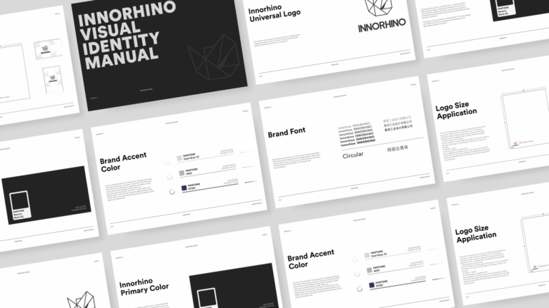
- Logo Usage: Precise instructions on how to use the logo, including minimum size, clear space, and variations for different applications.
- Color Palette: Detailed specifications of primary and secondary colors, including their intended use and combinations to maintain consistency.
- Typography: Guidelines on the use of typefaces, font sizes, and typographic hierarchy for headings, subheadings, and body text.
- Imagery Guidelines: Recommendations on the use of images, photographs, illustrations, and other visual components that align with the brand’s style and messaging.
- Voice and Tone Guidelines: Instructions on the brand’s communication style, including the tone of voice, use of language, and key messaging points to maintain a consistent brand voice.
Your visual identity guidelines are more than just a rulebook; they are the guiding principles that keep your brand image consistent, no matter where it’s seen. With these guidelines in place, your brand becomes a North Star for your team, illuminating the path to a powerful and enduring brand presence. So, when it comes to building a brand that leaves a lasting impression, remember that consistency is the key, and visual identity guidelines are your guiding light.
Partnering with experts who make your packaging POP
At INNORHINO, we have a team of experienced product specialists, designers, and in-house engineers who are dedicated to elevating your brand to the next level. We provide innovative packaging solutions that cater to your needs. Interested in collaborating with us? Send us an email at inquiry@innorhino.com!


