Which packaging colors should stay the same in every market, and which can you localize without weakening the brand?
Keep the one or two colors shoppers use to recognize your brand fixed everywhere, and specify them as spot colors with a tolerance your printer agrees to. Localize accents, flavor or variant coding, and limited editions instead. Before changing a core color for one market, confirm with in-market reviewers that the local meaning is a real problem, not a line from a generic color chart.
The exception is a core color that clashes with a strong category code or makes required text hard to read; then a regional variant can be worth the extra SKUs, plates, and inventory it creates. Validate in this order: local review, a digital thumbnail test, physical mockups under store lighting, and a press proof on the production board with the final finish applied.
Why Color Carries So Much Weight on Pack
Shoppers rarely read a package before they decide whether it belongs in their category. They scan for color first, then shape, then words. That is why a brand color does more work than almost any other design element: it helps a returning customer find you quickly and tells a new one what kind of product this is.
The figure most often quoted here comes from a 2006 review in Management Decision, which reported that 62–90% of a first assessment of a product is based on color alone (Singh, 2006). Treat it as a sign of how strong the effect can be, not a shelf measurement for your category. Research on multisensory perception points the same way: the color of a package or product shifts what people expect it to taste and smell like (The New Yorker on Charles Spence’s work), so a color change can change how the product itself is judged.
For a brand selling in more than one market, the practical question is narrower: which colors carry your recognition, which ones carry local meaning, and how sure you need to be before you change either.
Three Layers That Decide What a Color Means
A color on a carton is read on three levels at once. Separating them shows which decisions are global and which depend on the market.
| Layer | What drives it | What it means for design |
|---|---|---|
| Perception | Contrast, lightness, and visibility at shelf distance and in small online thumbnails. These behave fairly consistently across markets. | Get legibility and contrast right first. They are the least market-dependent decisions you will make. |
| Cultural meaning | Associations from religion, ritual, politics, and local history. They vary by market and by context, and they shift over time. | Localize accents and limited editions. Avoid redesigning a core color on the strength of a generic chart. |
| Category codes | Learned conventions within a shelf category, such as purple in UK chocolate or white and blue in oral care in many markets. | Decide on purpose whether to follow the code for fast recognition or break it to stand out, then test which one your shoppers reward. |
Category codes usually matter more than cultural symbolism for an everyday product. A shopper in a supplement aisle reads color against the products next to it far more than against a national color tradition.
Color Associations to Check With Local Reviewers
The associations below are commonly cited in cross-cultural design work. Use them as questions for in-market reviewers, not as rules. Meaning depends heavily on context: the same white reads as clean on a skincare jar and as somber on a gift box in a funeral setting.
| Color | Common positive cues | What to check locally |
|---|---|---|
| Red | Celebration and good fortune in China; energy and urgency in many retail settings | Can read as a discount or sale cue; associated with mourning in parts of South Africa |
| White | Clean, pure, clinical in many Western categories | Associated with mourning in parts of East Asia, especially in gift and ceremonial contexts |
| Green | Natural, fresh, plant-based | Can read as an environmental claim your packaging may not support |
| Blue | Trust, hygiene, technology | Can feel clinical or cold in indulgent food categories |
| Purple | Premium and indulgent in some categories, such as UK chocolate | Associated with mourning in some markets, including Brazil and Thailand |
| Black | Premium, bold, modern | Can feel heavy in gift or children’s categories; dark solids show scuffs and fold cracking |
| Yellow | High visibility, optimism, value | Weak contrast with white text; loses brightness on kraft or uncoated board |
What to Keep Global and What to Localize
The cleanest way to decide is to sort your colors by the job they do. The core brand color is the one shoppers use to find you; it stays fixed in every market, on every substrate, at the same specification. Accent and system colors handle flavors, strengths, or product lines; these can be localized where a market’s category codes differ. Limited and seasonal editions are where you can take creative risks, because they are short runs with a planned end date.
Every regional variant has an operational cost that rarely shows up in the design discussion. Each one adds a SKU to forecast, a separate print run or plate change, another color standard to approve, and inventory that cannot be moved between markets. A brand that localizes its core color in three markets is effectively running three packaging programs. That trade can be worth it when the local category code is strong, but it should be a deliberate decision with a business case, not a reaction to a color-meaning chart.
If you are using color to separate versions within one product line, the same discipline applies. We cover that in more detail in how to keep every version in a growing product line easy to tell apart, and the related question of how to set premium and everyday lines apart.
Will the Color Survive Production?
Most color problems we see do not come from choosing the wrong hue. They come from a color that looked right on screen and then shifted on the actual board, under the actual finish, from one print run to the next. For a global brand, that inconsistency weakens recognition more than any cultural mismatch.
Spot color or CMYK
A core brand color printed as a CMYK build drifts more between runs and between printers than a mixed spot ink. Specifying it as a spot color (a Pantone reference, for example) gives better consistency but adds an ink station and cost to each job. On digital presses, spot colors are simulated within the press’s color range, and some saturated oranges, greens, and turquoises cannot be matched closely. If your brand color sits in that range, check it early, before you commit to a print method.
Board, finish, and folding
The same ink looks different on coated white board, uncoated stock, and kraft. Kraft darkens and warms light colors; keeping a pale brand color bright may require a white base layer or a different board. Matte and soft-touch lamination usually make colors look deeper and less saturated, while gloss does the opposite, so approve color with the finish applied, not on an unfinished proof. Large dark solids also tend to crack at fold and score lines and show scuffs in transit. That is solved with board selection, grain direction, scoring, and lamination, not with a different color.
Lighting, tolerance, and screens
Approve color under a standard viewing light (the graphic arts standard is ISO 3664), then check it under the lighting of your main retail channel, since two inks that match under one light can separate under another. Agree a written color tolerance with your printer; there is no universal number, and what matters is that both sides measure against the same physical standard. For e-commerce, set your on-screen brand color from the approved printed standard, not the other way around, because screens can show colors that ink on board cannot reproduce.
Color also interacts with material and finish choices more broadly; our guide to how color, material, and finish work together covers that side.
Legibility, Accessibility, and Labeling Rules
Color choices that look good can still fail on required text. In the US, FDA food labeling rules set a minimum letter height of 1/16 inch for information panel text and expect it to contrast sufficiently with the background (21 CFR 101.2). In the EU, Regulation (EU) No 1169/2011 sets a minimum x-height of 1.2 mm for mandatory food information, or 0.9 mm when the largest surface is under 80 cm², and lists contrast between print and background as a legibility factor (Article 13 and Annex IV). Other product categories and markets have their own rules, so confirm the requirements for each SKU and market. Web accessibility guidelines such as WCAG are useful as a contrast check but are not a packaging labeling requirement.
Color vision deficiency affects about 1 in 12 men and 1 in 200 women among people of Northern European ancestry, with lower rates in most other populations (MedlinePlus). Red-green confusion is the most common form. If shoppers must tell flavors, strengths, or variants apart, do not rely on hue alone: pair color with words, numbers, patterns, or a clear lightness difference.
Requirements and figures in this section were checked in November 2026.
How to Test a Color Decision Before You Print
Testing works best as a sequence, where each step is cheaper than the one after it and filters out problems before they reach press.
1. Local review
Show the palette and front panel to people who live and shop in each target market, ideally including a retail buyer or distributor. Ask what the colors suggest about price, category, and occasion. If a concern comes up repeatedly, it is worth acting on; if it only appears in a color chart, it usually is not.
2. Digital thumbnail test
Where you sell online, run the options as listing images or ads and compare click-through. This shows whether a color helps your product get noticed among competitors at thumbnail size. It does not tell you how the color will print, so it informs direction, not final specification.
3. Physical mockups under store lighting
Print mockups on the intended board with the intended finish and place them next to real competitor packs. Check them at shelf distance and in the lighting of your main channel. This is where kraft, lamination, and dark solids reveal problems that a screen never shows.
4. Press proof and first-run check
Approve a proof on the production substrate against your physical color standard and agreed tolerance. On the first run, pull samples and keep them as the reference for future runs and for any second printer in another region. If the first run falls outside tolerance, that is the moment to adjust the ink or the specification, before a mismatch reaches multiple markets.
Two Brands That Show the Trade-Off
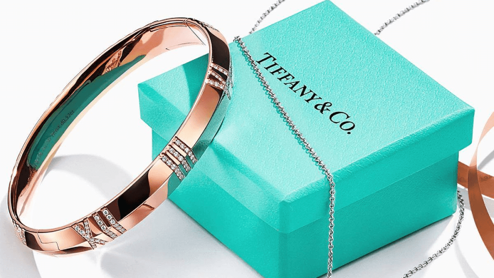
Tiffany & Co. shows what a fixed core color can become. Tiffany Blue has been a registered color trademark since 1998 and was standardized in 2001 as a custom Pantone color, “1837 Blue,” made exclusively for the company (Tiffany). The lesson for most brands is not the trademark itself, which takes decades of consistent use to support. It is the discipline: one color, specified tightly and reproduced the same way everywhere.
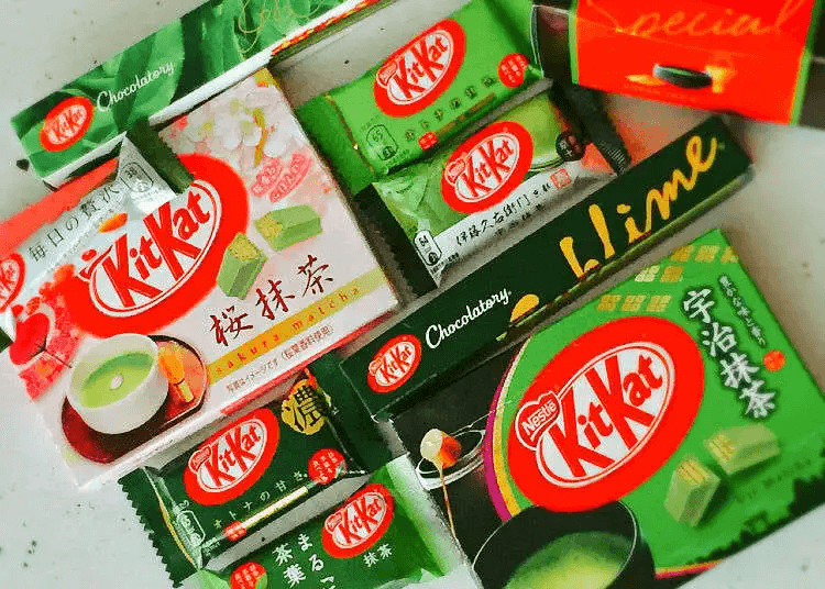
KitKat in Japan shows the other side. Nestlé launched the Uji Matcha KitKat there in 2004, and matcha became one of its best-known Japanese flavors before a version was brought to Europe in 2019 (FoodNavigator). The flavor packs use green while keeping the KitKat logo recognizable, which is the “keep the core, localize the accent” approach in practice.
Checklist Before You Approve a Global Palette
- Is the core brand color specified as a physical standard, with a tolerance your printers have agreed to?
- Has each target market’s reaction been checked with local shoppers or buyers, not only with a color chart?
- Does required text meet each market’s size and contrast rules on every panel and SKU?
- Can variants be told apart without relying on hue alone?
- Has the color been approved on the production board, with the final finish, under standard and in-store lighting?
Frequently Asked Questions
Can a brand own a color internationally?
Sometimes, through color trademarks, but protection is granted country by country and usually requires proof that shoppers already link the color to your brand. Tiffany Blue is a well-known example. Most brands get more value from specifying and reproducing their color consistently than from trying to register it.
Which matters more on pack, color or structure?
They do different jobs. Color is usually what shoppers notice first from a distance, while a distinctive structure reinforces recognition in hand and on repeat purchase. The two are strongest when they are designed together rather than in sequence.
Should we follow our category’s color code or break it?
Following the code helps shoppers place you in the category quickly; breaking it helps you stand out but can slow recognition. The right choice depends on how well known your brand is and how crowded the shelf is. Test both options with real shoppers before committing a full line.
When should we review our packaging palette?
Review it when something changes the conditions the palette was approved for: entering a new market, adding a product line, changing board or finish, switching printers or print method, or seeing competitors converge on your color.
Planning a regional variant, or moving your brand color onto a new board or finish? Send us your dielines, current color specifications, and target markets, and we will review where the color is likely to hold and where it needs testing. Talk with us. Let’s shape it together.