A Strategic Insight Report for Brand Leaders and Packaging Innovators by Yu-Jen CHEN
Introduction: The Power of Color in a Crowded Marketplace
In today’s hypercompetitive, visually overloaded market, color is more than a design decision—it’s a strategic imperative. According to WGSN, 98% of consumer purchase decisions are influenced by color, making it one of the fastest, most intuitive tools for brand recognition and emotional connection.
This is why Pantone’s Color of the Year isn’t just a trend forecast—it’s a cultural compass, guiding brand leaders and packaging designers toward relevance, resonance, and future-ready aesthetics.
For 2026, Pantone has chosen its most audacious color yet—and it’s not even a “color” in the traditional sense.
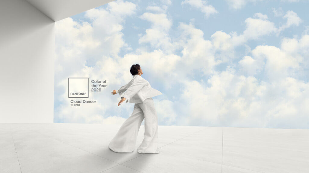
1. Unveiling PANTONE 11-4201 Cloud Dancer
Pantone’s 2026 Color of the Year is PANTONE 11-4201 Cloud Dancer—a soft, breathable white with a whisper of grey. It’s not cold or clinical like whites of the minimalism era. Instead, Cloud Dancer is warm, grounding, and emotionally restorative.
“The cacophony that surrounds us has become overwhelming… Cloud Dancer enhances our focus, providing release from the distraction of external influences.” — Leatrice Eiseman, Executive Director, Pantone Color Institute
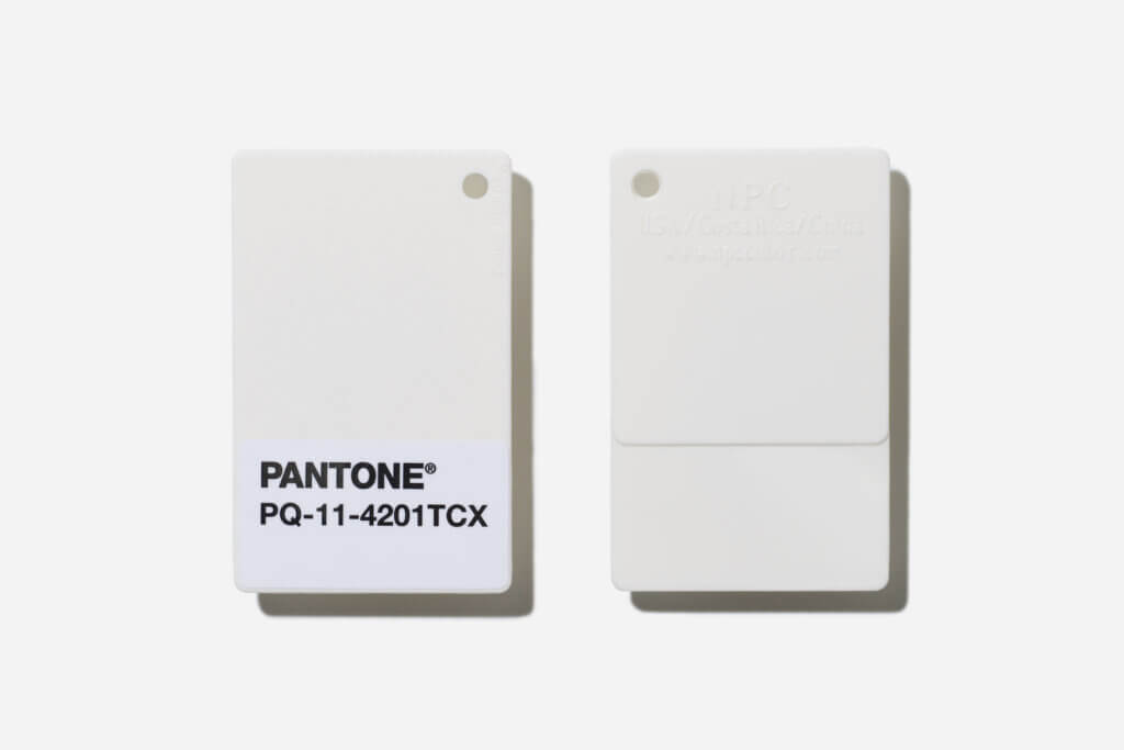
Its selection marks a historic first: the first true white ever chosen as Color of the Year in the program’s 27-year history.
In a world screaming for attention, Cloud Dancer speaks in calm clarity.
2. The Meaning Behind the Simplicity: What Cloud Dancer Communicates
Far beyond aesthetics, Cloud Dancer functions as a strategic narrative device, transmitting three high-impact brand messages:
1. A Blank Canvas for a Fresh Start
Cloud Dancer offers a visual reset—an invitation to start anew.
For brands, it signals:
- ✅ Innovation and forward-thinking
- ✅ A psychological “deep breath” for consumers
- ✅ A decluttered, focused identity
2. A Promise of Clarity and Calm
In a time of cultural noise and digital overload, this hue becomes an emotional counterbalance.
Brands that embrace it communicate:
- ✅ Serenity and mindfulness
- ✅ Quiet confidence
- ✅ Value without shouting
It turns products into mental relief moments, not just transactions.
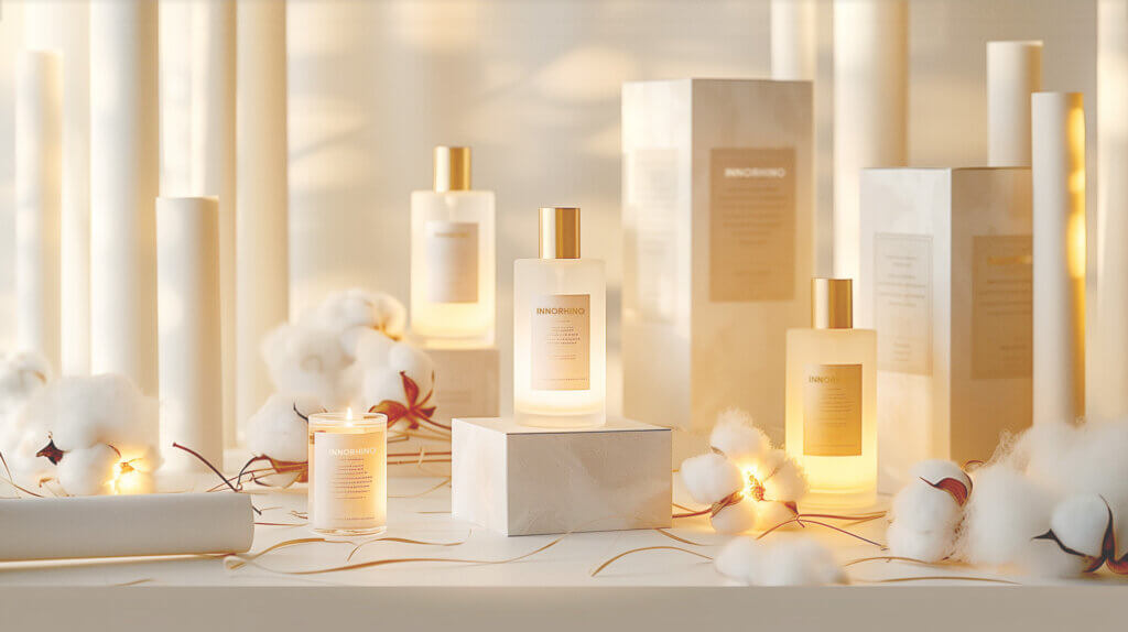
3. The Essence of Quiet Luxury
Cloud Dancer taps into the “quiet luxury” movement—understated, elevated, and timeless.
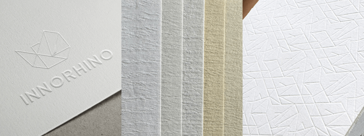
But execution matters:
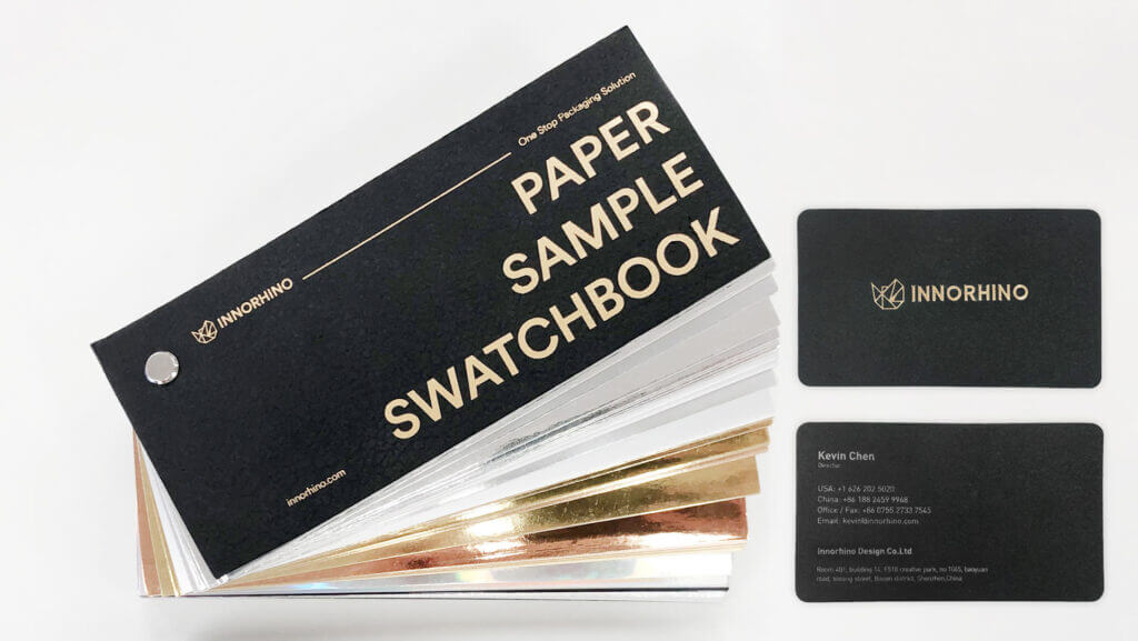
Quiet luxury fails when materials feel cheap. To succeed, pair Cloud Dancer with:
- ✦ Textured, high-quality substrates
- ✦ Precision finishes
- ✦ Thoughtful density and depth
Done right, this white becomes the pinnacle of refinement.
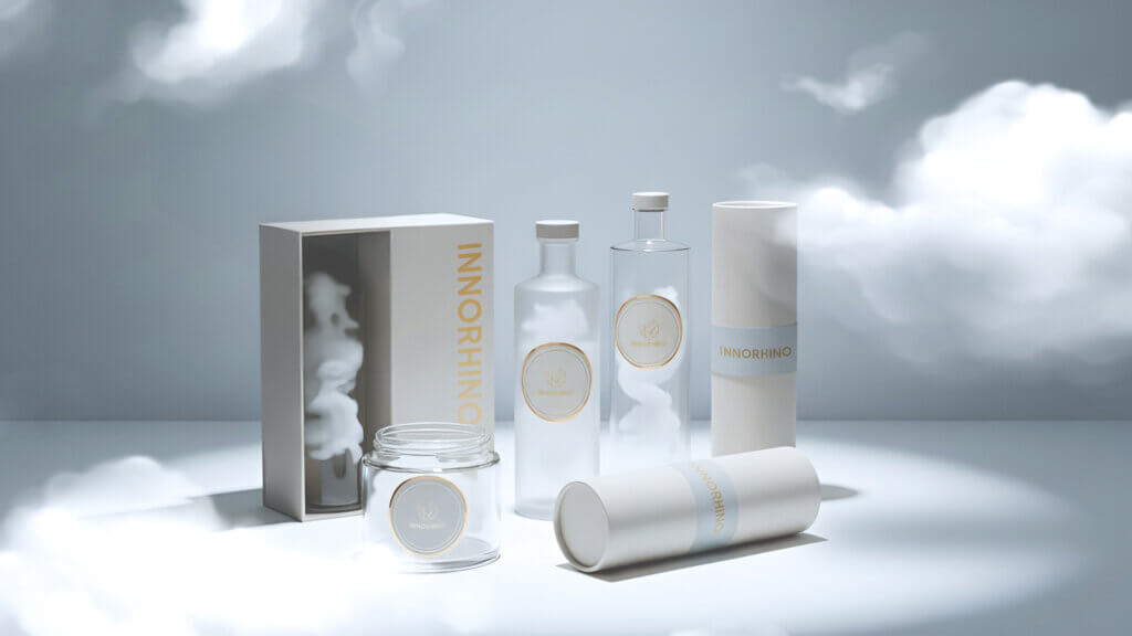
3. Strategic Applications for Brand Packaging
Cloud Dancer isn’t just an aesthetic choice. It’s a strategic tool for packaging differentiation in a noisy market.
✅ 1. Cut Through Market Noise with Material Integrity
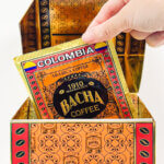
This color removes distractions, drawing focus to product quality. It’s high-risk if materials are subpar—but a powerful trust signal when craftsmanship is visible.
✅ 2. Amplify Messaging with High-Contrast Design
As a neutral base, Cloud Dancer lets logos, typography, and brand accents pop. Messaging becomes:
- Crisper
- Bolder
- More authoritative
Ideal for quick-scan packaging environments like shelves or social media feeds.
✅ 3. Strengthen Sustainable Storytelling
Pairing Cloud Dancer with eco-conscious materials creates a powerful dual message: Visual simplicity + environmental integrity.
It supports:
- Sustainable packaging claims
- Transparency
- Responsible design narratives
4. Real-World Examples: Cloud Dancer in Action
These brand applications showcase Cloud Dancer’s adaptability:
| Brand | Application Insight |
|---|---|
| Motorola | Cloud Dancer smartphone edition signals calm tech and digital balance |
| Post-it® / Command™ | Organizational tools evoke clarity, order, and minimal distraction |
| Le Creuset / Technivorm | Kitchenware elevated with functional elegance and modern heirloom appeal |
From tech to homeware, Cloud Dancer proves versatile across industries—from utility to premium, from mass to niche.


5. Navigating the 2026 Color Landscape
This year, brands must choose from a polarized color ecosystem, each hue aligned with a distinct consumer need state:
| Color | Trend | Emotional Territory |
|---|---|---|
| WGSN’s Transformative Teal | Activism & Ecology | Purpose, future-focus |
| PPG’s Warm Mahogany | Tactile Comfort | Intimacy, nostalgia |
| Pantone’s Cloud Dancer | Sanctuary & Reset | Calm, clarity, neutrality |
Strategic Advantage of Cloud Dancer: It becomes the “architectural white” that holds bold accents, activist graphics, or rich textures without visual conflict. It’s not the message—it’s the platform for the message.
Conclusion: Your Brand’s Moment of Clarity
Cloud Dancer is not just Pantone’s Color of the Year. It is a signal for brand leaders: to simplify, elevate, and emotionally reconnect.
In 2026, the best packaging will not scream—it will resonate.
Cloud Dancer enables you to:
- ✅ Reset your visual identity with intentional simplicity
- ✅ Build trust through material honesty and premium execution
- ✅ Deliver visual clarity in a cluttered world
- ✅ Ground your sustainability efforts in clean, authentic design
Is your brand ready to own the calm?
Ready to Redefine Your Brand with Clarity and Purpose?
INNORHINO specializes in next-gen packaging systems that merge design simplicity with premium substance. Let’s create packaging that communicates quiet confidence—and wins hearts through refined storytelling.
FAQ: Pantone’s 2026 Color of the Year & Packaging Strategy
Pantone selected Cloud Dancer to reflect the global desire for clarity, calm, and mental space amid chaos. It’s the first true white in Color of the Year history.
Yes—when executed poorly. But with premium textures and intentional design, white becomes a powerful cue of trust and quality.
By combining it with unique materials, contrast typography, or sustainability narratives, brands can amplify their storytelling through minimalism.
Not at all. In fact, Cloud Dancer provides the perfect neutral canvas for bold accent colors to shine more meaningfully.
No. While it aligns well with premium storytelling, it’s also effective in wellness, tech, and sustainability-driven categories.