Your brand’s visual identity goes beyond a mere logo; it’s a symphony of elements that work in harmony to captivate your audience. Among these, your color palette plays a pivotal role, defining your brand’s personality and evoking emotions. In this blog, we’ll explore the intricate world of color palettes, unraveling their influence on your brand’s identity and ensuring cultural resonance.
Table of Contents
Toggle- 1. Setting the Tone: The Main Color as a Brand Personality Shaper
- 2. Colors That Speak: Secondary Hues and the Art of Emotional Elevation
- 3. Color Psychology and Theory: Your Guide to Strategic Palette Selection
- 4. Cultural Nuances: The Unseen Impact of Color Across Borders
- Partnering with experts who make your packaging POP
1. Setting the Tone: The Main Color as a Brand Personality Shaper
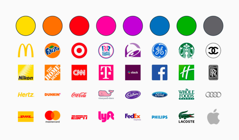
(Image source: Turbologo)
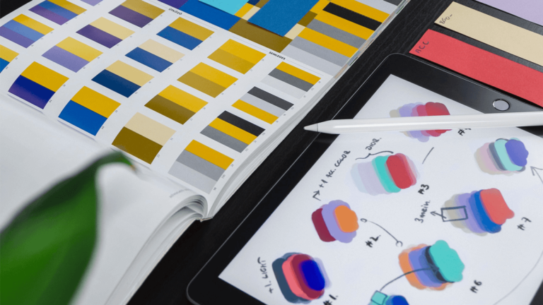
Color is more than a visual component; it’s a communicator of emotions and values. The main color in your palette acts as the conductor, setting the tone for your brand’s personality or core value — red for passion, blue for trust, or green for growth — these are not arbitrary choices; they’re strategic decisions that influence how your audience perceives your brand.
2. Colors That Speak: Secondary Hues and the Art of Emotional Elevation
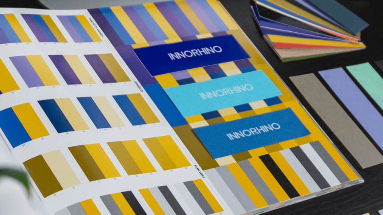
Secondary colors in your palette are like supporting actors, amplifying the emotions your brand conveys. They bring depth and meaning to your visual identity. For your logo to pop, you need a well-defined color palette that’s consistently applied across all your branding materials. Whether it’s your website, business cards, social media posts, or product packaging, using the same set of colors creates a cohesive and memorable brand image.
3. Color Psychology and Theory: Your Guide to Strategic Palette Selection
(Image source: Space Refinery)
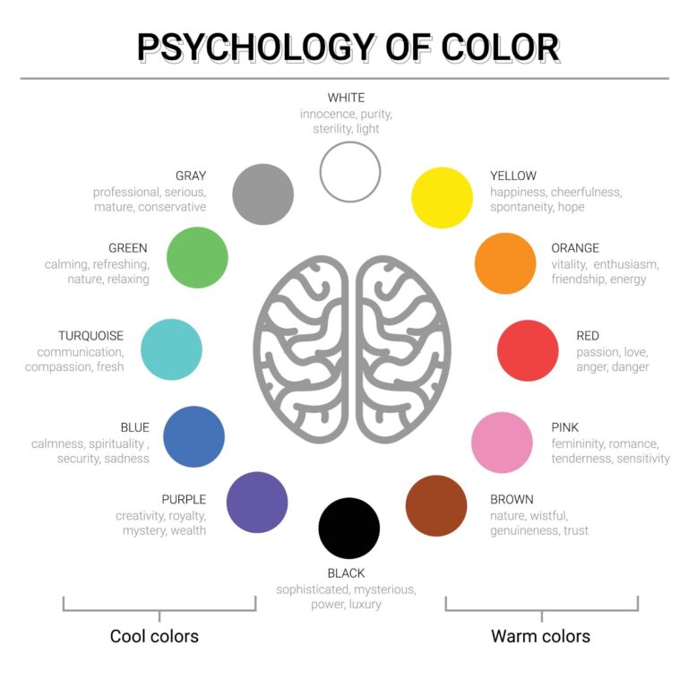
Choosing the perfect colors isn’t a random task. Delve into color psychology and theory to understand how different shades influence human emotions and behavior. Unearth the tools that will guide you in selecting a color palette that resonates with your target audience.
4. Cultural Nuances: The Unseen Impact of Color Across Borders
(Image source: Colours & Materials)
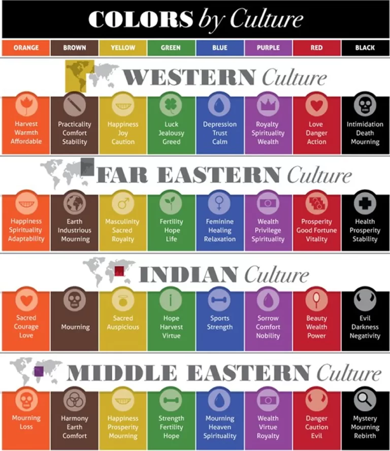
Colors don’t speak the same language everywhere. Unveil the importance of considering cultural differences when crafting your brand’s color palette. Red might signify love and passion on Valentine’s Day yet could symbolize danger in the traffic system. Or, when white is associated with purity at a wedding in the West, it could also be linked to the concept of mourning at a funeral in the East.
Your brand’s color palette isn’t just about aesthetics; it’s a strategic tool to shape your brand’s personality, invoke emotions, and establish a cultural connection. The art of crafting a vibrant brand identity begins with the colors you choose.
Partnering with experts who make your packaging POP
At INNORHINO, we have a team of experienced product specialists, designers, and in-house engineers who are dedicated to elevating your brand to the next level. We provide innovative packaging solutions that cater to your needs. Interested in collaborating with us? Send us an email at inquiry@innorhino.com!

